Dec 27, 2015
Recently, I took on clients who found me through friendly connections. That’s often how I come to work for people and I have to say, for me, it’s the best way.
The best way because new prospective clients have usually seen my efforts first hand and have a sense from their friends how I work and what the experience was like for them — which is always a great experience for all involved or I wouldn’t keep getting hired.
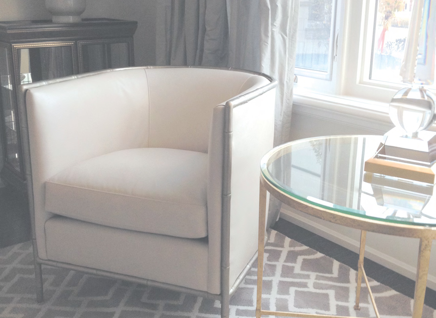
 My first meeting with my new clients took place in their well-appointed apartment suite which sits in a busy partb of town high in the air overlooking the twist-and-turns of the tree-lined lanes of always rosy Rosedale. I suggested a few ideas of how we could turn their somewhat dated and drab pied a terre into something really wonderful.
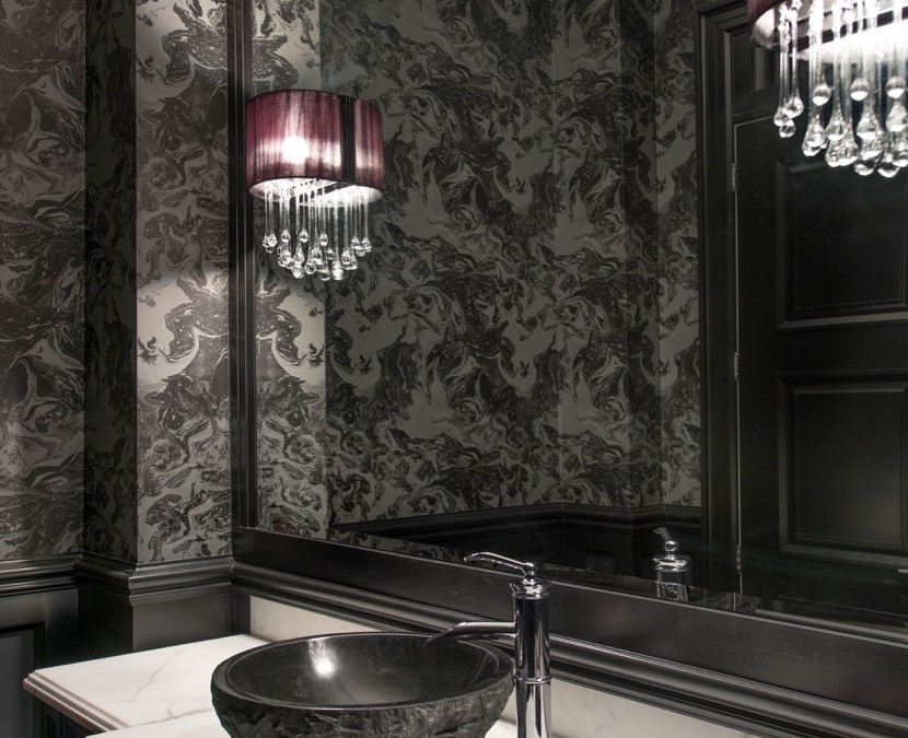
As a designer, when I’m confronted with a dreary space lacking in character and style, I always arm myself with black. Black is beautiful. It can turn drab and dowdy into charming and chic in a single stroke of a brush, lashing of fabric or framing of art.
The biggest design mistake anyone can make is not using black in a room. I never allow my clients not to. However, where I wanted to use black in this instance was met with gasps of astonishment and shock not dissimilar to if I had suggested attending a Mother’s Day celebrations at an orphanage.
Next to the living room sits a rather delightful conservatory that looks north over the aforementioned lush enclave. I wanted to replace the mousy brown of the window frames with black. As well, I wanted to coat the dated brassiness of the cocktail table in living in the dark designer favourite, as it would instantly elevate both the room and piece of furniture into something so much more.
 After much talk and handholding, my clients agreed to the window frames but not the table, which is a real shame because it is a great piece with wonderful lines that’s now lost in the dull 90’s “brassosphere”. I can only suggest and hope at the end of the day, it’s not my house.
In another instance where I suggested using black to clients I was met with cheers and adulation. I wanted to paint all the doors in their stately apartment in glossy darkness. It turned an already great home into something approaching interior design nirvana. Such a simple thing but made a huge difference in setting the tone of luxurious
and stylish living.
If, like some, you are hesitant about using black in your home don’t be afraid to start small — framing pictures, a side table here, a lamp there, coating woodwork or moldings and then graduate to doors and perhaps whole rooms.
Start with a powder roomfor example or entryway you’ll be surprised at the impact and glamorous fun you will create. Be fearless and remember, black is beautiful!
Oct 23, 2015
Have you ever wondered what fabric to use where? As a designer I’m always being asked about fabrics and where they should go.
‘What do you think of this fabric for my sofa?’
‘I really love this fabric for drapery, will it work?’
 Recently, I was in a restaurant when a rather excited lady recognized me and came up to my table where I was sitting. She barely blurted out ‘hello’ and then proceeded to pull out
a fist full of fabrics from her purse.
(You’d be amazed how many of us walk around town with paint chips and fabric samples shoved in our bags.) Then, oblivious to all around her, went on to ask me what I thought of the textiles. I told her that they were very nice but that she had chosen all the wrong fabrics for all the wrong places.
I then invited her to book an appointment through my office so we can get the selections right for her.
After that encounter, it reinforced in me what I already know, that so many people, although well intentioned, often are blind as to what fabrics to use where.
Choosing soft linen for a sofa is okay but it may not give you the durability you need in your family room.
The same can be said for choosing upholstery fabric for drapery. It won’t ‘drape.’ More often than not, I have been hired after the fact when so many costly mistakes have been made.
 So, in an effort to help you make the right choices, I wantto share with you some simple things to look out for when choosing fabrics. When covering furniture, always look to upholstery weight fabric. In general, I love working with the wide selection of Robert Allen Fabrics myself.
Keep in mind fabric that is specifically made to be used on furniture and is made of all types of cotton, linen, poly and silk and is priced accordingly. I always make sure I know the number of “rubs” a fabric can withstand. A very durable fabric will have anywhere from 50,000 to 100,000 “double rubs.”
This will be perfect for family room sofas and chairs, kitchen chairs, benches, desk chairs and kid’s rooms.
There is upholstery fabric that has less double rubs and is more delicate these can be used on furniture that needs less durability such as occasional chairs, living room sofas, dining room chairs, headboards and accent pillows.
Drapery weight fabric is different from upholstery weight fabric in that it is much lighter, generally speaking, and obviously gives a softer effect to your window treatments.
When properly constructed and lined silks, linens and cotton twills are all excellent options for drapery.
When choosing fabrics for your home always remember, suitability, appropriateness and your lifestyle.
Keep in mind too the type of fabric. Upholstery weight vs. drapery weight. 100,000 double rubs versus 10,000. Sofa vs. window. I know it may sound simple but so many get it so wrong.
So, now when you see me in a restaurant and go to reach into that bag of samples, know with confidence that what you can walk on by without question. But please do say hello!
Oct 2, 2015
At the moment I’m arguing with clients, well, let’s call it having a heated debate, over whether to paint or not to paint the kitchen cabinets in their new home. We are performing quite an extensive renovation in absolutely every other part of the 1920s north Toronto house but the kitchen is in fairly good shape so we decided to just do a little‘ cosmetic job.’
 By cosmetic I mean fresh coats of paint, new light fixtures and curtains, or so I thought. When I showed my clients the colour I had planned for the cabinets a very beautiful French dove gray the colour of the chairs at Dior, they said: “Wait, what, we’re painting the cabinets”?
In an effort to save cash my clients thought that we’d leave the cabinets alone and just do the walls as they believe the cabinets are “fine” and “very good quality”.
True the cabinets are very good quality but in my opiniona little dated colour wise and I, as a designer, don’t do “fine”. I do wow! I explained to my clients that in my experience having worked quite literally on a ton of kitchens that the quickest way to update at very low cost is through paint.
Painting your cabinets can completely transform the space and won’t cost a fortune.
A few things to consider when painting your cupboards are:
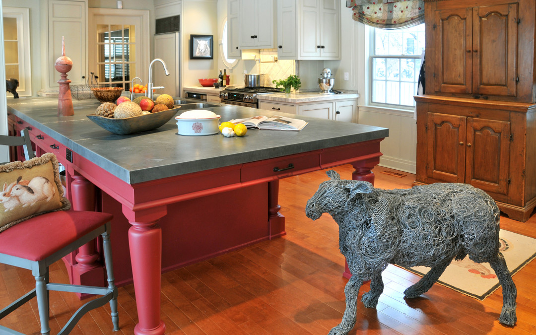
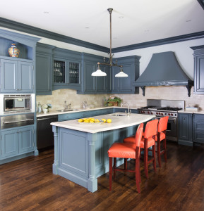
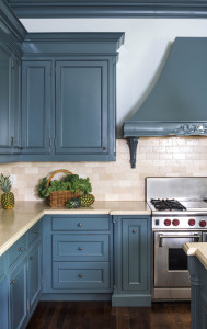
Colour is your friend. When I design a kitchen, I like it to be approachable functional and a little playful. Gone are the days of just all brown or all white cabinets (although all white does work in very contemporary kitchens). I often like to paint the majority of the cabinetry in one colour then use an accent colour on an island, a pantry door, counter stools or the interior of the cabinets.
 Recently I painted a client’s cupboards and island all the same striking shade of blue and accented with great art and counter stools covered in vintage orange leather. Stylish, with a “trad-temp” mix, for a very chic result.
Another project took a completely different direction with creamy cabinets and a fire engine red island with a zinc top made from the roof of an old French church. The result was a very relaxed “country-luxe.”
For a very large and lightfilled family kitchen, I used a silvery grey colour on the bulk of the cabinets and a very strong bright white on the island and range hood.
The contrast provides great interest — and when mixed with Carrera marble counters and backsplash — it becomes extremely elegant.
When thinking about updating your kitchen, you don’t always have to reach for the hammer. Try the paintbrush first. Adding colour to your cabinetry and a few other bits and pieces can completely enliven a tired kitchen and give it that wow that makes all the difference.
Jul 17, 2015
One of the questions I get asked most is “How do I make a room look more interesting?” Interesting can be a fairly loaded word, but what I think people are really asking me is,
“What can I do to make my home different from everyone else’s?”
My answer is: mix it up! There is nothing more boring than a room filled with things all from one store or for that matter filled with objects from the same period.
For example, all mid-century modern or all French country. If you crave a space that is interesting, personal and original then you’re going to have to choose things from different design periods, parts of the world and creative movements and bring them all together under one roof.
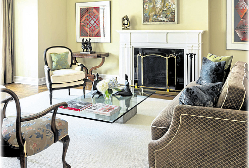
In my own living room I have a sleek contemporary coffee table of Carrera marble and stainless steel, French country caned back chairs with seats covered in raw linen, a gilded console table from the 19th century made in Rome all surrounded by 20th and 21st century contemporary art and photography.
I mixed it up and it looks great! In my work as a designer I make it a point to educate my clients on the value of mixing various design elements.This often shows itself quite obviously when I have clients who are merging two households.
Recently, I have been working with a couple, one of whom collected quite a bit of contemporary art and the other who loves 19th century Canadian antiques. They thought their styles clashed, but instead I showed them the value in celebrating their differing tastes. I used the various elements to our advantage.
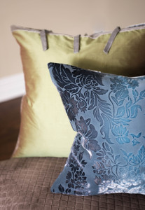
By doing that we created a totally original and some would say, surprising, interior. Another easy way to mix it up is to layer various textures, patterns and colours. This can be done easily with accessories such as pillows, carpets and throws. Using strong graphic patterns with florals or antiqued fabrics with a modern metallic can be really fun.
For something a little more daring, wallpaper is a great tool to help layer and create a unique mélange. Also, don’t be afraid to hang artwork on top of wallpaper. Some people have a real hang-up, pardon the pun, about this thinking
— that it’s wrong to hang art on wall covered in paper
— when in fact you should feel free to do so and that’s what makes it special.
I also really like to layer carpets. For example I enjoy sisal carpets laid down on top of hardwood or stone and then on top of that sisal lay a Persian or other highly stylized or graphic carpet. This not only warms up the space but it creates drama and sophistication in a very easy way.
When you’re looking to create a truly personal and original space remember to mix it up. I always go by my adage if you love everything in the room individually, it will all work collectively. So take some chances, be original and be sure you love every single thing that surrounds you.
If you do this the mix will create the most unique, special and unexpected environment in which to live.
Jun 5, 2015
As soon as the last snowflake melts, I start to lighten up and so do my clients! Our design office is abuzz with questions, queries and calls.
The big question on their minds is: What can I do to freshen the house up for summer?
When working with clients I always start with these tried and true, never-fail tips and tricks that always amaze and delight. It’s easy and simple, and the results have real impact.
 They will take your home from the doldrums of winter to the sun-dappled shores of the Hamptons in a matter of minutes.
Lamp shades Switch out darker lamp shades for lighter ones. If you can find pink light bulbs (try online), swapping those with your usual white it makes a big difference.
Slip covers Invest in a pair of sturdy, well made light coloured slipcovers. A set in white, tan or a pastel shade made of linen, cotton, or sail cloth will not only make it seem as if you
have bought all new furniture, but will help lift the mood of any room.
Drapes If you can, remove your drapes completely and let the sunshine in. If that’s not an option, swap out your winter drapes for lighter sheers or cottons with a beautiful floral
or nautical design, or even a French ticking stripe. This will add a softness and airy feel to your space.
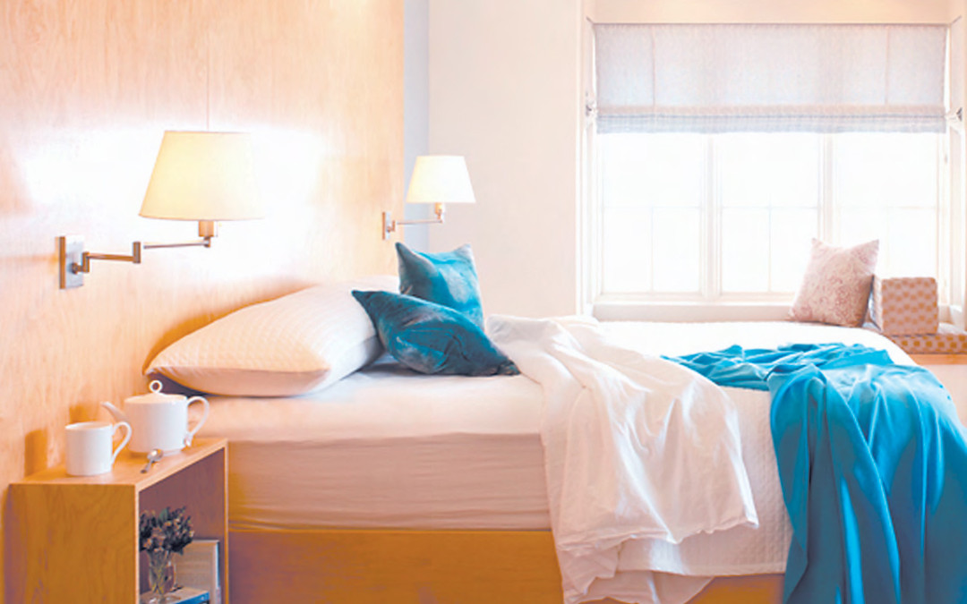
Bed linens A very easy change to make is your bed linens. Pale blues, cool mauves or mint green, this season’s hot colours, will add lightness and freshness to all your summer dreams.
Carpets If you have hardwood, concrete or tile floor and usually cover them with area carpets, roll them up for the season. This one thing will make a huge impact on your space. Give it try!
Clear the decks If you can only do one thing this spring, be sure to edit your space. Be ruthless.
Get rid of junk, clear all surfaces; your counter top, your coffee table, your nightstands and vanity. It makes a huge difference.
Rearrange Rearrange your furniture. It costs nothing and can make your home feel fresh and brand new. Same with art. I like picture rails or shelves that allow you to easily move your favourite pieces of art and pictures around the house so that it allows fresh new looks.
Outdoor space If you are lucky and have a garden, terrace or even a little city balcony, don’t forget about it. There are so many options to make these spaces more attractive and useful.
Outdoor furniture has come a long way. Outdoor carpets, too, have advanced to the point where I use them indoors. Plant pots with herbs and colourful annuals such as geraniums for the immediate French feel, or succulents to evoke that Palm Springs vibe.
Whatever you do to welcome summer into your home, remember to have fun and enjoy yourself. It’s far too short a season, so make it look good!
 My first meeting with my new clients took place in their well-appointed apartment suite which sits in a busy partb of town high in the air overlooking the twist-and-turns of the tree-lined lanes of always rosy Rosedale. I suggested a few ideas of how we could turn their somewhat dated and drab pied a terre into something really wonderful.
 After much talk and handholding, my clients agreed to the window frames but not the table, which is a real shame because it is a great piece with wonderful lines that’s now lost in the dull 90’s “brassosphere”. I can only suggest and hope at the end of the day, it’s not my house.


Recent Comments